Sunday, 27 March 2011

Double Page Spread Analysis 2

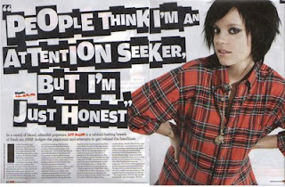
On the right is a double page spread from the magazine NME. The article is about Lily Allen who is an outgoing pop star who abides by her own rules. 
The first thing that strikes us is a floating quote which reads "People think I'm an attention seeker but I'm just honest". The typography looks like the letters have been cut out from all sorts of magazines. This suggests that Lily Allen is always in the public eye and always being shown in the tabloids. It also gives us an insight to her personality as she would not be in the newspaper for no reason. This could hint at the fact that she is very outgoing and is a rebellious character.
The background is plain white which attracts our attention to the only thing that is not black or white. Lily Allen is wearing a red and black stripped top to stand out from the background and put the attention on to her. It makes her look more important and outrageous. Lily Allen has tilted her head to the side almost to show some attitude which is supporting by her scruffy hair and eye make up. Lily Allen has her hands by her waist whilst staring at you with her dark beady eyes. Her posture and stance connote that she hasn't a care in the world and looks out for only herself. It comes off as this message is being aimed towards the reader due to the fact that she is staring at the reader. Lily Allen's dark eye liner hints at the fact that she is a rock artist which is shown through the dark colours she is wearing. She is wearing very little make up and jewellery unlike many other stars which makes her unique and gives makes her look simple.
The layout of the article is also simple as there is not too much going on. One picture, a floating quote and a article. The space is used up very wisely and all the attention is on Lily Allen. The article isn't too busy which plays to the advantage of the newspaper as they will think that it is not too much to read but at the same time, the floating quote keeps the reader enticed  and keeps it looking interesting. Due to the simpleness of the article it may be for a slightly older audience of about 20+. 
Tuesday, 22 March 2011

Double Page Spread Analysis 1

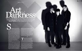
The Masthead uses a very old fashioned and sophisticated typography. It uses a simple White font which the 'of' behind. This could suggest mysteriousness and that they are the sort of band that hide in the shadows which could also connote the type of music genre they play. It could be niche as it is in the shadows and not as big as mainstream.
We can see that there is a cross behind the Main Heading very similar to the sign that connotes 'irritant' in a science lab. Which could hint that this might not be everyone's type of music and some people may find that its not there cup of tea. It also makes the band seem dangerous and scary.
The colour scheme makes it look like the picture was taken when you could only get black & white televisions and photographs. Which suggests that this article would appeal to a more elder and sophisticated audience. This is reinforced by the fact that the main article is flowing rather than a Q&A because it is a more sophisticated way of presenting the the main article. The colour scheme also links to the title as it gives off a dark and gloomy look and atmosphere.The main image draws your attention because it is big and uses a whole half of the double page spread just on this image.  The light shone on them illminates them making them look more important but at the same time creating a shadow overhead which makes them look more intimidating and largely more frightening. The posture of the group is very slouched and almost as if they do not care about anything in the world. The artists facial expressions are very serious and they do not show a glimpse of happiness. They are also wearing simple clothes, all black. This may indicate that there still of music is very simple and not to everyone's taste. There clothes would only appeal to sophisticated audiences as the younger audience would like more vibrant colours. The two men seem to be protecting the woman as they seem to be in an almost defensive stance with their sleeves rolled up. However the women does not seem like she requires protection, she seems frightening and seems to be expressing her masculine side with her extremely short hair cut she seems to blend in with the rest of the band

Saturday, 19 March 2011

Feedback

Sanjay, since adding my last post you have not done as outlined in the targets set. You must attend to this ASAP if you are to achieve a reasonable research and planning mark. In addition, you should show evidence of your work in progress i.e. the orginal photographs and stages of constructing the front cover. This will need to be done for each page you create.
Your front cover is a good first attempt. It requires some work e.g. airbrushing, work on typography (needs to appear more in line with R'n'B conventions) and sell lines that don't make reference to existing artists.

Final Main Cover