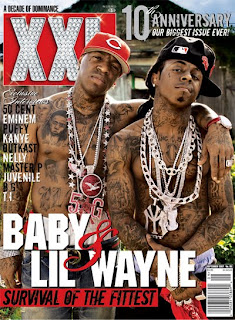
 The masthead for XXL is a unique selling point. The typography is big and chunky. This suggests that it is aimed towards the male audience as these two characteristics suggest masculinity.
 The Masthead is made of diamonds which suggest wealth and luxury. This helps us indicate what kind of genre it is, as a stereotypical rap artists 'swagger' would be that they wear baggy clothes and are drenched in bling.
The background of the masthead catches peoples eye as it is red and eye popping.
The main cover lines typography is also big and chunky. The main cover line is of baby and lil wayne. These are big artists in the RnB genre and anyone who likes this genre of music, knows who they are. Using well known characters, it will draw people in to pick up and read the article.
The cover lines '&' has a different sort of typography which gives us a sophisticated feel to the magazine.
Above the masthead we can see the puff which states 'A decade of dominance'. The puff is used to promote the magazine and exaggerate how good the magazine is. This puff suggests that this magazine has been the best magazine of this genre and the use of alliteration in the puff emphasizes this and makes people want to pick of the magazine and see what all the hype is about.
The sell lines on the left of the magazine has a variety of artists which are specific to XXL genre. They show exclusive interviews with Kanye West, Eminem etc. The magazine name drops famous artists in that genre in order to encourage people to buy the magazine. If someone saw an artist on the cover in which they know of, this person will pick it up because it has made them curious. Also the use of so many artists will create a larger audience. For example some people may not like Eminem however love Kanye West, they will pick up the magazine just for that interview.
The main image portrays Baby and Lil Wayne looking tough and looking like a very stereotypical rap artist. They are both wearing jewelry to show off their 'bling' and almost makes them look superior. This 'bling' also links to the font style of the masthead.
The artist follow the colour scheme of black and red as they are wearing black and red chains. This is to give the magazine a more professional look to it and make everything look more seamless.
They're showered in tattoos, which suggests that they have had a hard life and it shows that they are strong men as they can with stand the pain of having a tattoo numerous times.
But we can also see that they are half naked, they're body language suggests toughness because they are brave enough to make themselves look vulnerable. It also encourages a female audience to pick up the magazine as they may find the two artists on the cover attractive. This done by manipulating the that sex sells.
No comments:
Post a Comment