Wednesday, 27 April 2011
Sunday, 10 April 2011
Evaluation Question 3
We decided to choose IPC Media to publish our magazine as they are the biggest publisher in the UK. They also have a large variety of music magazine from 'Look' to 'NME'. However they are yet to publish an RnB music magazine. Thanks to the IPC brand it will be very easy to attract customers to buy the music magazine. Also we can utilise the publishers other magazines to encourage readers from their to read our magazine. For example we can attract audiences from the magazine 'Look' which is a fashion magazine and will be read by the female public ranging from 16-24. This is also the type of age range we are aiming for. Also IPC publish 'Zoo' which is a magazine for young men. IPC publish Mousebreaker.com which is a website for online games, this will also have people from the age of 15-20 on the website. IPC is also a brand that highlights quality. If our magazine is published by IPC others will believe it is of top quality and better then the other magazines on the market. As IPC is one of the biggest publishers in the UK, it will mean that our magazine will be swiftly out in stores. The majority of magazines created from IPC are mainstream magazines which mean they will have no problem in publishing our magazine as RnB is one of the most popular music genres at the moment. Hence IPC would be a great choice to publish my magazine as their brand identity will attract customers and already know how to deliver to masses of audiences.
Saturday, 9 April 2011
Unselected Images
I liked this image however, it came out blurred and thus had to be eliminated.
In this image my model was smiling and was not how I wanted him to be represented, I wanted a 'bad boy' type.
In this image the models face was too dark to use.
I liked this image however did not know where to use it an felt I had better images.
This image was too blurry and thought I had better images
Wednesday, 6 April 2011
Sunday, 27 March 2011
Double Page Spread Analysis 2
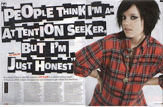 On the right is a double page spread from the magazine NME. The article is about Lily Allen who is an outgoing pop star who abides by her own rules.
 The first thing that strikes us is a floating quote which reads "People think I'm an attention seeker but I'm just honest". The typography looks like the letters have been cut out from all sorts of magazines. This suggests that Lily Allen is always in the public eye and always being shown in the tabloids. It also gives us an insight to her personality as she would not be in the newspaper for no reason. This could hint at the fact that she is very outgoing and is a rebellious character.
The background is plain white which attracts our attention to the only thing that is not black or white. Lily Allen is wearing a red and black stripped top to stand out from the background and put the attention on to her. It makes her look more important and outrageous. Lily Allen has tilted her head to the side almost to show some attitude which is supporting by her scruffy hair and eye make up. Lily Allen has her hands by her waist whilst staring at you with her dark beady eyes. Her posture and stance connote that she hasn't a care in the world and looks out for only herself. It comes off as this message is being aimed towards the reader due to the fact that she is staring at the reader. Lily Allen's dark eye liner hints at the fact that she is a rock artist which is shown through the dark colours she is wearing. She is wearing very little make up and jewellery unlike many other stars which makes her unique and gives makes her look simple.
The layout of the article is also simple as there is not too much going on. One picture, a floating quote and a article. The space is used up very wisely and all the attention is on Lily Allen. The article isn't too busy which plays to the advantage of the newspaper as they will think that it is not too much to read but at the same time, the floating quote keeps the reader enticed and keeps it looking interesting. Due to the simpleness of the article it may be for a slightly older audience of about 20+.
Tuesday, 22 March 2011
Double Page Spread Analysis 1
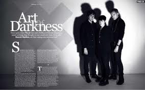 The Masthead uses a very old fashioned and sophisticated typography. It uses a simple White font which the 'of' behind. This could suggest mysteriousness and that they are the sort of band that hide in the shadows which could also connote the type of music genre they play. It could be niche as it is in the shadows and not as big as mainstream.
We can see that there is a cross behind the Main Heading very similar to the sign that connotes 'irritant' in a science lab. Which could hint that this might not be everyone's type of music and some people may find that its not there cup of tea. It also makes the band seem dangerous and scary.The colour scheme makes it look like the picture was taken when you could only get black & white televisions and photographs. Which suggests that this article would appeal to a more elder and sophisticated audience. This is reinforced by the fact that the main article is flowing rather than a Q&A because it is a more sophisticated way of presenting the the main article. The colour scheme also links to the title as it gives off a dark and gloomy look and atmosphere.The main image draws your attention because it is big and uses a whole half of the double page spread just on this image. The light shone on them illminates them making them look more important but at the same time creating a shadow overhead which makes them look more intimidating and largely more frightening. The posture of the group is very slouched and almost as if they do not care about anything in the world. The artists facial expressions are very serious and they do not show a glimpse of happiness. They are also wearing simple clothes, all black. This may indicate that there still of music is very simple and not to everyone's taste. There clothes would only appeal to sophisticated audiences as the younger audience would like more vibrant colours. The two men seem to be protecting the woman as they seem to be in an almost defensive stance with their sleeves rolled up. However the women does not seem like she requires protection, she seems frightening and seems to be expressing her masculine side with her extremely short hair cut she seems to blend in with the rest of the band
Saturday, 19 March 2011
Feedback
Sanjay, since adding my last post you have not done as outlined in the targets set. You must attend to this ASAP if you are to achieve a reasonable research and planning mark. In addition, you should show evidence of your work in progress i.e. the orginal photographs and stages of constructing the front cover. This will need to be done for each page you create.
Your front cover is a good first attempt. It requires some work e.g. airbrushing, work on typography (needs to appear more in line with R'n'B conventions) and sell lines that don't make reference to existing artists.
Your front cover is a good first attempt. It requires some work e.g. airbrushing, work on typography (needs to appear more in line with R'n'B conventions) and sell lines that don't make reference to existing artists.
Tuesday, 1 March 2011
Sunday, 27 February 2011
Feedback
Sanjay you have made a very good effort with the research and planning work. However you still have few tasks oustanding e.g. sketches and your preliminary task. In addition, your audio upload doesn't appear to be working properly so please check this.
Thursday, 24 February 2011
Contents Page Analysis 2
 The main image is centred in the middle of the page to act as a focal point. The main image also links to the main article which draws most of the customers in. In order to sell more copies of the magazine, it has made the image large and more noticeable from the rest of the page. The contents page is very busy with large variety of colours and a lot seems to be packed in to this page. This is done to make the audience think that you get a lot more for your money as the busyness suggests that there is so much to read, it could last you a long time.
This magazine is aimed at a slightly younger audience. The age bracket would be around 18-25. We can see this because if it was aimed at a younger audience, there would be less going on in this page and it would be less complicated. However the large array of colours hints that it is for a younger audience.
In addition, the images are composed in a similar way to how a collage would be crafted, generating the idea that the magazine is quite spontaneous and haphazard as opposed to displaying a fixated structure.
The difference of colours in each box suggests a different personality for each section of the magazine and makes it easier for readers to navigate to the pages they want to go to.
The tie-in at the bottom of the page encourages readers to subscribe to the magazine by saying that each issue will only cost 20p. The magazine suggests that if you are addicted to music you have to get this offer. Most readers will enjoy music as they have bought a magazine on it.
Front Page Analysis 3
The genre of this music magazine is RnB. This is easily shown by the typography used in the masthead. It is big, red and bold. This represents toughness and dominance. The use of such a strong typography suggests it is not a niche genre and as RnB is one of the most mainstream genres it dominates the music industry much like its typography represents. The masthead has a cut through itself in order to create a brand identity and reflect the name of the music magazine as 'Blender'.
The main image is one of the most famous rap artists in this generation who goes by the name of Jay-Z. Using such an influential character as the main image will draw consumers attention into the magazine as the notice the man on the cover. We can see that the magazine is aimed towards an older audience, reflected by Jay-Z's clothing, he is well dressed which attracts a sophisticated audience. Jay-Z is wearing a large diamond ring which represents wealth and superiority. However it keeps its sophistication with the 'bling' being very subtle rather than him being drenched in chains and other sorts of jewellery. Jay-Z's facial expressions suggest that he is tough and is not someone you would mess around with. This also attracts women to buy it as many of them like a 'bad boy' and will encourage the female audience to buy the magazine for the sex appeal.
The background is all white, this makes everything else stand out. It makes Jay-Z seem largely more important and 'in your face'. The red masthead contrasts the background and makes the masthead more noticeable and more people will see and remember the magazine increasing brand awareness.
The main cover line states 'The fly life of an American gangster'. This suggests that Jay-Z is a gangster however does not depict the stereotypical representation of a gangster suggesting that the stereotypical picture we see is wrong all together. The sell line encourages us to buy the magazine as we want to know what the famous rapper has been up to and the mentioning of his love interests - Beyonce - reinforces the want to buy the magazine as everybody loves famous couples.
Thursday, 17 February 2011
Front Page Analysis 2
We can see that the masthead is in capital letters apart from the 'e' at the end. This could suggest that vibe wanted to be a bit more unique then other music magazines of the same genre. The typography of the masthead is blue which links back to the chilled out feel of the magazine and blue is a universal colour meaning it appeals to both men and women, doing so maximises the target audience. The masthead is big and bold which makes it more eye catching and appealing to the audience.
The main image is of usher who is a current RnB artist. He is very successful and is a world wide phenomenon, known by millions. The camera is at a low angle shot, this increases the importance of Usher as it is almost as if he is superior to us and we should look up at him. His head is tilted to show his confidence as an artist. Compared to XXL, Vibe is not as 'blinged' out. It is more subtle in the way it presents itself. Doing this appeals to an older audience who are more sophisticated and don't just like shiny things. The fact that Usher is wearing glasses makes gives a nice swagger about him and makes him out as if he is mysterious and perhaps not worthy enough to make eye contact with him. The glasses show Ushers importance.
The word ‘swagger’ is shown in graffiti style which makes it stand out a bit more off the page. The magazine draws in its readers by its additional cover lines which tells the reader what they can expect to see inside. The word 'sex' is used many times on the front page to draw in readers this is because in these modern times, sex sells. People are more open about sex and like to read about celebrities love lives and how to improve there own.This also gives us an idea of the target audience. As they are mentioning sex, it will have an older audience ageing from 16-25. The main cover line goes hand in hand with the main image as they are about the same subject. The main cover line backs up the theory of Usher being very important in the industry is at refers to him as the 'king' which is connotes importance and royalty. The fact that they write 'sexy issue' at the bottom it makes it more unique and hints that its not a normal magazine, its a special edition magazine. This will encourage the reader to buy it as they will think that they cannot buy this 'sexy issue' every week.
Contents Page Analysis 1
The contents page strikes the reader as it is well structured and has a simple design with good use of colours and layout. This allows for the reader to retrieve the information from the page easily. . The Masthead attracts us very well. ‘Drummer’ is big and bold and instantaneous. Its the first thing we see on the page. This enables us to know what sort of genre this magazine is. The ‘drummer’ stands out and is the largest text on the page by a large margin.
The magazine is most likely going to be aimed at younger audience as it is not very complicated. It has many pictures by has a simple layout which is easy to navigate through. There are many images with drums in them which links to the masthead. The drums is a loud instrument and jumps out of the page at you This suggests that it is a Rock magazine. The use colours black and red are dark colours which also connote that it is not a music genre such as RnB but rather something like Rock. We can clearly see the genre thanks to the good use of colours.The colours make the contents page look elegant and simple. By keeping the colour scheme simple, it relates to the target audience as they are young, they will prefer something simple with lots of pictures. Right in the middle of the contents page there is a sub heading in bold white saying ‘Exclusive. This draws in the reader and excites them as they feel like they can gain something from this magazine that you cant get from any other magazine. This encourages readers to buy the magazine.
The magazine is most likely going to be aimed at younger audience as it is not very complicated. It has many pictures by has a simple layout which is easy to navigate through. There are many images with drums in them which links to the masthead. The drums is a loud instrument and jumps out of the page at you This suggests that it is a Rock magazine. The use colours black and red are dark colours which also connote that it is not a music genre such as RnB but rather something like Rock. We can clearly see the genre thanks to the good use of colours.The colours make the contents page look elegant and simple. By keeping the colour scheme simple, it relates to the target audience as they are young, they will prefer something simple with lots of pictures. Right in the middle of the contents page there is a sub heading in bold white saying ‘Exclusive. This draws in the reader and excites them as they feel like they can gain something from this magazine that you cant get from any other magazine. This encourages readers to buy the magazine.
Front Page Analysis 1
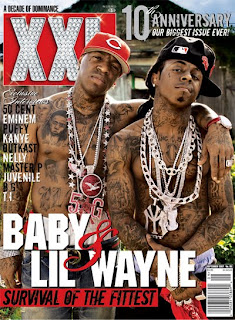 The masthead for XXL is a unique selling point. The typography is big and chunky. This suggests that it is aimed towards the male audience as these two characteristics suggest masculinity.
 The Masthead is made of diamonds which suggest wealth and luxury. This helps us indicate what kind of genre it is, as a stereotypical rap artists 'swagger' would be that they wear baggy clothes and are drenched in bling.
The background of the masthead catches peoples eye as it is red and eye popping.
The main cover lines typography is also big and chunky. The main cover line is of baby and lil wayne. These are big artists in the RnB genre and anyone who likes this genre of music, knows who they are. Using well known characters, it will draw people in to pick up and read the article.
The cover lines '&' has a different sort of typography which gives us a sophisticated feel to the magazine.
Above the masthead we can see the puff which states 'A decade of dominance'. The puff is used to promote the magazine and exaggerate how good the magazine is. This puff suggests that this magazine has been the best magazine of this genre and the use of alliteration in the puff emphasizes this and makes people want to pick of the magazine and see what all the hype is about.
The sell lines on the left of the magazine has a variety of artists which are specific to XXL genre. They show exclusive interviews with Kanye West, Eminem etc. The magazine name drops famous artists in that genre in order to encourage people to buy the magazine. If someone saw an artist on the cover in which they know of, this person will pick it up because it has made them curious. Also the use of so many artists will create a larger audience. For example some people may not like Eminem however love Kanye West, they will pick up the magazine just for that interview.
The main image portrays Baby and Lil Wayne looking tough and looking like a very stereotypical rap artist. They are both wearing jewelry to show off their 'bling' and almost makes them look superior. This 'bling' also links to the font style of the masthead.
The artist follow the colour scheme of black and red as they are wearing black and red chains. This is to give the magazine a more professional look to it and make everything look more seamless.
They're showered in tattoos, which suggests that they have had a hard life and it shows that they are strong men as they can with stand the pain of having a tattoo numerous times.
But we can also see that they are half naked, they're body language suggests toughness because they are brave enough to make themselves look vulnerable. It also encourages a female audience to pick up the magazine as they may find the two artists on the cover attractive. This done by manipulating the that sex sells.
Tuesday, 15 February 2011
Feedback
Sanjay, you have made a good start to the research and planning work.
Target: work through the checklist to complete the remaining tasks e.g. textual analysis.
Target: work through the checklist to complete the remaining tasks e.g. textual analysis.
Monday, 14 February 2011
Saturday, 12 February 2011
Monday, 31 January 2011
Music Magazine Suggestions!
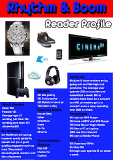
Name: Rhythm and Boom
Genre: RnB
Audience: Teenagers 11-19
Level Crtiteria : 5
Puff: Its Boom!
Solo Artist
Genre: RnB
Audience: Teenagers 11-19
Level Crtiteria : 5
Puff: Its Boom!
Solo Artist
Monday, 24 January 2011
Brainstorm of Music Magazine
Genre - My magazine will be a RnB genre. This is due to my high level of interest in that genre and the knowledge I already know of this type of music. This will allow me to create a better overall music magazine
Target Audience - This magazine will be aimed at the young adults and older teenagers. This age group ranges from 15-21. As this is a mainstream genre it will help attract a large amount of people.
In my magazine I will plan on using a solo artist as it makes the main focal point on a single object or person which will allow us to project an image for our magazine in a more direct way.
Brand Identity - Our colour scheme will be mellow colours that represent a relaxed feeling. For example colours such as light blue etc. represents a chill out vibe to it which is what we want our audience to feel whilst reading the magazine.
In order to attract readers I will try to make the magazine as eye catching us possible by using stand out colours, Bold font and having a large main image that will stand out to the audience.
Subscribe to:
Comments (Atom)
